
Businesses often respond by buying more traffic. They increase social media activity, run paid advertising, or invest in content. But sending more people to a website that does not convert can simply increase wasted marketing spend.
Before putting more money into traffic, ask a more useful question: is your website helping customers move toward your business, or is it giving them reasons to leave?
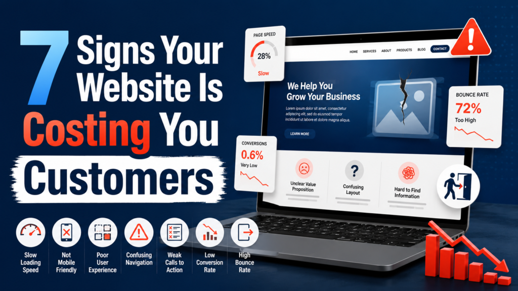
Your website may look completely fine from the inside. The logo is visible, your services are listed, the contact page works, and you may even receive a few enquiries every month. But that does not automatically mean the website is helping your business as much as it should.
A website can be online, functional, and visually acceptable while still quietly losing customers. Visitors may leave because pages load too slowly, the offer is difficult to understand, the mobile experience is frustrating, or the next step is not obvious. Most of those people will never tell you what went wrong. They simply leave and continue looking elsewhere.
That makes website problems easy to miss. In a physical shop, you may notice when a customer looks confused or walks away. Online, someone can arrive, struggle for a few seconds, and disappear without leaving any feedback.
The following seven signs can help you find out.
People do not like waiting for websites. A visitor usually clicks because they want information immediately, and they may be comparing several businesses at the same time. If your page takes too long to appear, opening another result requires almost no effort.
A slow website is especially damaging when you are paying for traffic. Someone sees your advertisement, becomes interested, clicks, and then waits for the page to load. The marketing did its job, but the website weakened the experience at the most important moment.
Slow performance can come from oversized images, heavy videos, unnecessary scripts, excessive plugins, weak hosting, or complicated page elements that add little value. A beautiful homepage is not useful if visitors have to wait before they can interact with it.
Google’s official guidance on Core Web Vitals focuses on loading performance, interactivity, and visual stability. The current Core Web Vitals include Largest Contentful Paint, Interaction to Next Paint, and Cumulative Layout Shift. These measures give businesses and developers a useful framework for judging how real users experience a page.
Do not rely only on how fast the site feels on your own office connection. Test important pages on mobile as well. Review the homepage, service pages, advertising landing pages, product pages, booking pages, and contact pages. Google’s PageSpeed resources can also help identify performance problems and possible improvements.
A faster website does not need to be visually boring. Good design and good performance can work together. The goal is to keep the elements that help customers understand and trust the business while removing weight that exists only for decoration.
If customers are waiting before they can understand the offer or take action, speed is no longer a minor technical issue. It is part of the customer experience and part of the sales process.
Open your homepage and imagine you know nothing about the company. Can you understand what the business does within a few seconds?
Many websites fail this simple test because they lead with vague statements such as “Building a Better Future Together” or “Innovative Solutions for Modern Challenges.” These phrases may sound polished, but they do not tell a customer what the company actually provides.
Clarity is usually more valuable than cleverness. A visitor should quickly understand what you offer, who it is for, what problem you solve, why the business is credible, and what they should do next.
Imagine someone searching for accounting support. One website says “Accounting and Tax Support for Small Businesses in Lahore.” Another says “Empowering Your Journey Toward Success.” The first message is much easier to understand because the customer immediately knows whether the service may be relevant.
Businesses often write websites from their own perspective. Employees understand internal terminology, service names, and company language because they use them every day. Customers may not. A consultancy might describe a service as “Integrated Strategic Transformation,” while a potential buyer is simply trying to find help with business processes or digital systems.
Simple language does not make a business look less professional. It reduces the effort required to understand the offer.
The same principle applies to businesses investing in digital marketing. A visitor should quickly understand the offer, the value, and the next step without searching through several pages. A clear service presentation, such as the approach used by KM Marketers, can help potential customers understand what a business provides and feel more confident before making contact.
Review your homepage headline, supporting text, service descriptions, and main calls to action. Remove phrases that sound impressive but communicate very little. Your customer should not have to solve a puzzle before deciding whether your business can help.
A website may look excellent on a desktop computer and still provide a poor experience for people using phones. That matters because customers often discover businesses through search results, social media, advertisements, WhatsApp links, or recommendations while they are already on a mobile device.
Common mobile problems are easy to recognize. Text may be too small, buttons may be difficult to press, images may extend beyond the screen, menus may be confusing, popups may cover important content, or forms may be awkward to complete. Sometimes a page was designed for a large screen first and never properly tested on smaller devices.
Google recommends responsive web design as a practical way to provide mobile friendly pages and also uses the mobile version of site content for indexing. That makes mobile usability important for both visitors and the wider visibility of the site.
Do not test only whether the homepage opens. Complete the actions that matter to customers. Use the navigation. Read a service page. Click the phone number. Fill in a form. Try to make a booking. Add a product to a cart if you sell online.
Imagine a customer trying to request a quote from a phone. The form contains many fields, the keyboard covers part of the page, and the submit button is difficult to reach. The visitor closes the page. From the business side, nothing appears to have happened because no form was submitted. In reality, a potential customer was lost.
This is why website performance should not be judged only by successful enquiries. You also need to think about people who attempted an action and abandoned it.
Mobile usability should be treated as a basic requirement. If an important task feels awkward when you test it yourself, a first time visitor may find it even more frustrating.
Customers make judgments quickly. Your company may have experienced staff, strong results, and excellent service, but new visitors can only judge what they see.
An outdated or neglected website can create doubt. Visitors may wonder whether the company is still active, whether the information is current, whether anyone will answer an enquiry, or whether it is safe to share personal or payment information.
Trust is influenced by many small details. Poor quality images, broken links, old information, incorrect contact details, spelling mistakes, inconsistent fonts, and pages that look unfinished can all reduce confidence. Generic stock images can also make a business feel less credible when they have little connection with the actual service.
The answer is not to redesign the site every year just to follow visual trends. A business website should look current, intentional, and maintained.
Trust can also be strengthened through evidence. Use genuine testimonials where appropriate. Show real examples of work. Display relevant certifications. Explain the process customers can expect. Introduce the team when individual expertise matters. Make contact details easy to verify.
The website should reduce uncertainty rather than create more questions. A professional site does not need complicated effects. It needs to make the business feel reliable, clear, and active.
Review the pages a new customer is most likely to see first. If the online presentation looks weaker than the real business behind it, the website may be costing you opportunities before anyone speaks to your team.
Every important page should have a purpose. After reading it, what should the visitor do next?
Depending on the business, the answer might be to call, request a quote, book a consultation, buy a product, register, send a message, or schedule an appointment. If the next action is unclear, many visitors will simply leave.
This is where calls to action matter. A call to action tells the visitor what step to take. Clear examples include “Request a Quote,” “Book a Consultation,” “Call Us,” “Shop Now,” or “Schedule an Appointment.”
A common mistake is making the customer search for the action. Someone may read an entire service page and reach the bottom without seeing any obvious contact option. They then have to return to the menu, find the Contact page, and work out what to do. Some people will make that effort. Others will not.
The opposite problem is presenting too many equal choices. A page may contain buttons saying “Learn More,” “Explore,” “Discover,” “Get Started,” “Talk to Us,” and “Request Information.” When every action appears equally important, the page becomes harder to understand.
Choose one primary action for each important page and make it visible. Supporting options can still exist, but they should not compete with the main goal.
Place calls to action at logical moments. Do not make visitors reach the last sentence of a long page before giving them a way to continue. At the same time, avoid aggressive popups that ask for commitment before the visitor understands the offer.
Give people enough information to feel comfortable, then make the next step easy.
Generating interest is only part of the job. The website must also make it easy for that interest to become an enquiry, booking, registration, or sale.
Businesses often design forms around every piece of information they would ideally like to collect. Customers see the same form as work. A simple enquiry may suddenly ask for a full name, phone number, company, job title, address, industry, budget, project type, preferred date, and a long message.
Every extra field increases effort.
There are situations where detailed information is genuinely necessary, especially for complex applications or professional consultations. But ordinary enquiries should usually ask only for the information needed at that stage. More details can be collected later.
The W3C Forms Tutorial recommends simple, clear forms and notes that irrelevant or excessive requests can increase abandonment. It also emphasizes proper labels and instructions so people understand what information is expected.
The same thinking applies to booking and checkout processes. If customers must create an account before making a simple purchase, ask whether that step is necessary. If a booking process contains several screens, check whether some can be simplified.
Contact information should also be easy to find. Phone numbers should be clickable on mobile when calling is important. If WhatsApp is a normal sales channel, make it easy to access. If customers visit a physical location, provide clear details.
After a form is submitted, explain what happens next. A short message telling customers when they can expect a response creates more confidence than a generic confirmation.
If people repeatedly call because they cannot complete an online process, the customer may not be the problem. The process may be the problem.
This is one of the strongest warning signs. Your analytics show visitors, advertisements receive clicks, and social media sends people to the website, but enquiries, bookings, or sales remain low.
That does not automatically prove the website is responsible. Traffic quality matters. Pricing may be wrong, competition may be strong, the offer may be weak, or visitors may not be ready to buy. But the website should still be investigated.
Look at where people leave. Are visitors reaching a service page and disappearing? Are they starting forms but not completing them? Do product pages receive views without purchases? Does one landing page perform much worse than another? Are mobile visitors abandoning the site more often?
These patterns can reveal where the customer journey is breaking.
Also compare the promise in your advertising with the page people reach. Imagine an advertisement offering a free website consultation. The visitor clicks and lands on a general homepage containing many unrelated services, with no mention of the consultation. Now they must search for the offer they were promised.
A better approach is to send advertising traffic to a page that directly matches the message. The headline should confirm that the visitor is in the right place, the page should explain the offer, and the next step should be obvious.
Marketing and website experience should work together. Traffic alone is not the objective. The website needs to help qualified visitors become customers.
Business owners often know their websites too well. You know where the contact button is, which menu contains pricing, what each service name means, and which information is slightly outdated. A new customer knows none of this.
Start on the homepage. Can you tell what the company offers? Can you see who the service is for? Is there clear evidence that the business is credible? Is the next step obvious?
Then open an important service or product page. Does it explain the customer’s problem and the solution, or does it mostly talk about the company? Does it answer likely questions? Does it provide enough information for someone to continue?
Test the contact process as well. Count the steps and fields. Repeat the entire journey on a phone.
Another useful approach is to ask someone outside the company to complete a simple task, such as finding your phone number, requesting a quote, booking an appointment, or explaining what the company does. Watch without guiding them.
That confusion is useful information because real customers may be experiencing exactly the same thing.
If you identify several problems, do not try to redesign everything at once. Start with issues closest to customer experience and revenue.
First, make sure the website works. Fix broken pages, forms that fail, incorrect contact information, serious mobile problems, and major speed issues.
Next, review clarity. Make sure visitors understand what you offer, who you help, and what action they should take.
Then improve the important customer journeys. Make contacting, booking, buying, or requesting information as easy as practical.
After that, strengthen trust. Update old information, improve weak imagery, add relevant evidence, and make the business process clearer.
Finally, keep testing. A website should not be built once and ignored for years. Customer expectations change, technology changes, and your business changes. Regular small improvements can prevent the gap between your real business and your online presence from becoming too large.
A redesign should solve specific business problems, not simply make the site look different. Changing colors or animations will not help if customers still cannot understand the offer or complete the next step.
Your website may be costing you customers without generating a single obvious complaint. Visitors rarely send a message explaining that the page was slow, the homepage was confusing, or the form asked too many questions. They simply leave.
That is why these seven signs matter. Your website may be hurting results if it loads slowly, makes the business difficult to understand, performs poorly on mobile, looks untrustworthy, hides the next step, creates a complicated enquiry process, or receives traffic without producing enough meaningful actions.
Do not judge the site only by whether it looks attractive. Judge it by whether it helps customers.
Can people find what they need? Can they understand the offer? Can they trust what they see? Can they contact you easily? Can they complete important actions without unnecessary effort? Does the website support your marketing instead of weakening it?
A good website should reduce friction. It should make the business easier to understand and easier to choose.
If it does the opposite, the hidden cost may be much greater than the price of fixing it.
The same principle of clarity applies to digital marketing. Businesses need a website and marketing presence that explain the offer clearly, build trust, guide visitors toward action, and support the wider customer journey across search, social media, advertising, and content. This requires clear and consistent communication.
If your website is attracting visitors but not turning enough of them into enquiries or customers, KM Marketers provides practical digital marketing support focused on improving visibility, messaging, customer journeys, and conversion opportunities. Support can include search engine optimization, content strategy, social media marketing, paid advertising, website messaging, campaign planning, and performance review according to business goals.
The aim is to help businesses understand where potential customers are being lost and improve the marketing experience with clearer communication and stronger decisions. Whether you are reviewing website content, improving landing pages, planning campaigns, strengthening search visibility, or trying to generate better quality leads, focused marketing support can help you use your digital presence more effectively.
You can learn more about KM Marketers services or get in touch.
Your Trusted Marketing Partner!
KM Marketers is a digital marketing solutions provider helping businesses grow through SEO, social media, content marketing, and paid advertising. Our focus is on delivering measurable results, building strong online visibility, and driving quality leads for clients across different industries.
Email: info@kmassignmentservices.com
kmdigitalmarketing2025@gmail.com
WhatsApp: +60 16-522 4321
Head Office: Galleria Cyberjaya, Parking lot, Jalan Teknokrat 6, Cyber 5, 63000 Cyberjaya, Selangor, Malaysia.
Hours: Mon–Sat 10:00 AM to 07:00 PM
© 2026 KM Marketers. Powered by KM Software Services Sdn. Bhd. (1308207-U). All Rights Reserved.